Posts

Showing posts from 2013

A Quilter's Perogative

Image
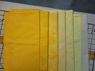
I'm not sure why, but lately I have had problems choosing fabric colors for my quilts. Perhaps it is because I have been too busy to work on my own quilts and am out of practice. It may also be that I have been studying color theory and realizing that there is a lot more to choosing colors than I had previously known. Going by instinct can work, but I think I have been over-thinking my choices the past few months. Finishing the Blue Lily quilt has been difficult. I think I have made my final fabric choices, pin the quilt on my design wall, and after looking at it for a few days I realize I don't like it.   The orange pieced background above was my first choice. I thought using complementary colors would be a great choice. But this background overpowers the lily appliques. I also learned that orange isn't the complement of blue on the Ives color wheel, but that orange-yellow was the complement. I didn't like orange-yellow, though. It was also too strong.

Yellow Tones

Image
I hand-dyed some yellow tones a few days ago. They are the 3 fabrics on the left. Since I didn't have any gray dye, I used the complement of yellow which is violet. The photo doesn't show the tones in their true color. They are actually a mustard color. I think I now have a wide enough range of yellows to use in my color quilt. The tubs below are what I used to dye my fabrics in. The tub on the right is a pale yellow. It's the 4th fabric on the left. The yellow dye is very strong and I wanted a very pale yellow. I may still need to dilute the yellow even further to get a paler yellow. I'll have a better idea when I start auditioning the fabrics together in the quilt design.

Hand-dyed Yellow Fabric

Image
Here are the results of my hand-dyed yellow fabrics. The 5th fabric from the left in the lower section of fabric is the pure yellow color. To the left of that are the diluted yellows and to the right are the shades of yellow. What a difference from the commercial yellow fabrics that I pulled! Those run too much to the yellow-orange range for my project. I'm so glad I decided to dye some fabric to see what the difference would be. Next I'll try dyeing some tones of yellow and see what I get. Then I'll start playing around with a design for the quilt.

Blue Lily

Image
The "Blue Lily" quilt I was working on last year has sat in my WIP draw for quite a while. I couldn't bring myself to quilt it because I didn't like the background. This is the second background I've auditioned with the applique. I wanted contrasting colors of blue and orange, but it just wasn't working. Today, I pulled the applique off of the background (it wasn't fully fused yet) and started auditioning other pieces of fabrics I had in my stash. The piece that looked the best was a yellow. Here we go with yellow again! Of course, I didn't have a piece big enough to get a good idea of how the quilt would look, so I went shopping again and bought 2 different pieces of yellow. I pinned the yellow fabric up on my design wall and pinned the applique on top of that. The piece on the left looks washed out and even though it has a small print in it, it reads as a solid, so I am going to go with the piece on the right. It isn't as bright a

Color Quilt

Image
The Fancy Threads Art Quilter's group has started two new group quilt projects. The first is a color quilt. All twelve quilters have picked out a color on the color wheel to make a 15 x 30 inch. quilt. These quilts will be displayed side-by-side in rainbow color order. The only rule is that the quilt has to be predominately the pure color you have chosen as well as tints, tones, and shades of that color. You may use small amounts of other colors. Any technique is acceptable. My color is yellow. So I have searched through my stash and found that I don't have much in the way of yellow fabrics. A shopping trip was in order. These are the fabrics I found. A nice range of tints, but I couldn't find shades of yellow. To get shades of a color you add black. When you add black to yellow, you get green at some point. But what shade of green? So this evening I decided to dye some fabric from pure yellow to tints and shades. I mixed 2 bottles of yellow. The left bottle i

Fall Colors

Image
We have a hill behind our house that is covered with trees. In the fall we get beautiful colors for only a day or two. This year I caught the color at it's peak.

Painted Calla Lily

Image
I've finished painting my first project from Annette Kennedy's class "Painted Pictorial Quilts". This class is offered on Craftsy .  I will add the stamen later. This is what the project started out as. Quite a difference!

Hawksbill Reef Complete

Image
It's hard to believe that it's been a year since I posted last. I have taken a full-time job outside the home and as a result I don't have as much time to post or to quilt for myself. I have recently completed "Hawksbill Reef". I made multiple changes with the design, changing it from whimsical to realistic and back again. I was never quite satisfied with the way it was turning out. In the end, I decided to keep it whimsical as opposed to more realistic looking. I've used Angelina fibers, colored pencil, and tsukineko craft inks. It is quilted with Glide thread because I love the shine it gives, as well as YLI Longarm Pro Thread. The batting is Hobbs 80/20. One thing that I learned from this quilt, (I learn something from every quilt I make),  is that I want to improve my painting skills. So, I'm in the process of taking a couple of classes on painting pictorial quilts. My first project is underway - and is a small project so it is manageabl